Typography as Image
This assignment for a typography class focused on taking the letters and glyphs that make up a typeface and using those to create artwork on a grid.
About the Project
Created from an assingment for a Typography class, these outcomes exemplify succeeding to achieve the goals of the assignment.
They showcase:
A) artistic choice with the typeface used, in this case being Suburban OT, and
B) an understanding of letter form, space, and composition by utilizing design principles.

The Process
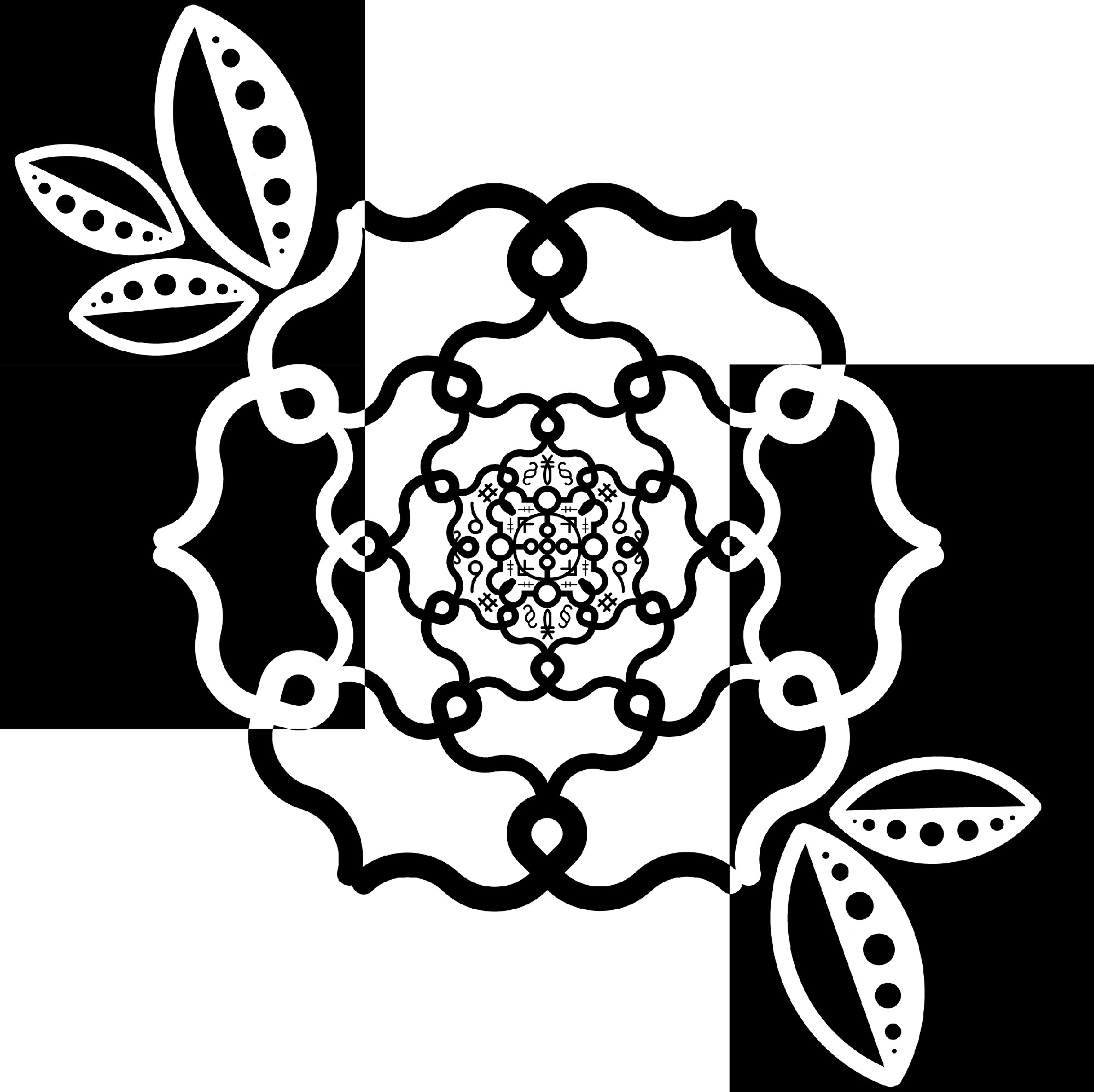
The Flower
The first of the series we will call The Flower. It was by far the most complicated of the three as it not only had to set the tone of the other two, it was also my introductory foray into Adobe Illustrator.
The making of this piece started as a central repeating pattern that mirrored across 6 sides, focusing on the middle of the grid to begin with.

Growing from there, the piece bulked up, gaining more petals using the same } shape as the inner layers had. Eventually I realized that there was too much white space and added some initially symmetric petals to balance it out.

The third process image shows my exploration into using inverting on a diagonal within the grid, although this was mostly kept in the end product, the white against black in the middle added too much visual noise.

The final version of this piece has asymmetric petals, helping to break up rigidity while bringing some of that balance back in with 2/3 inverted grids on either exterior side.
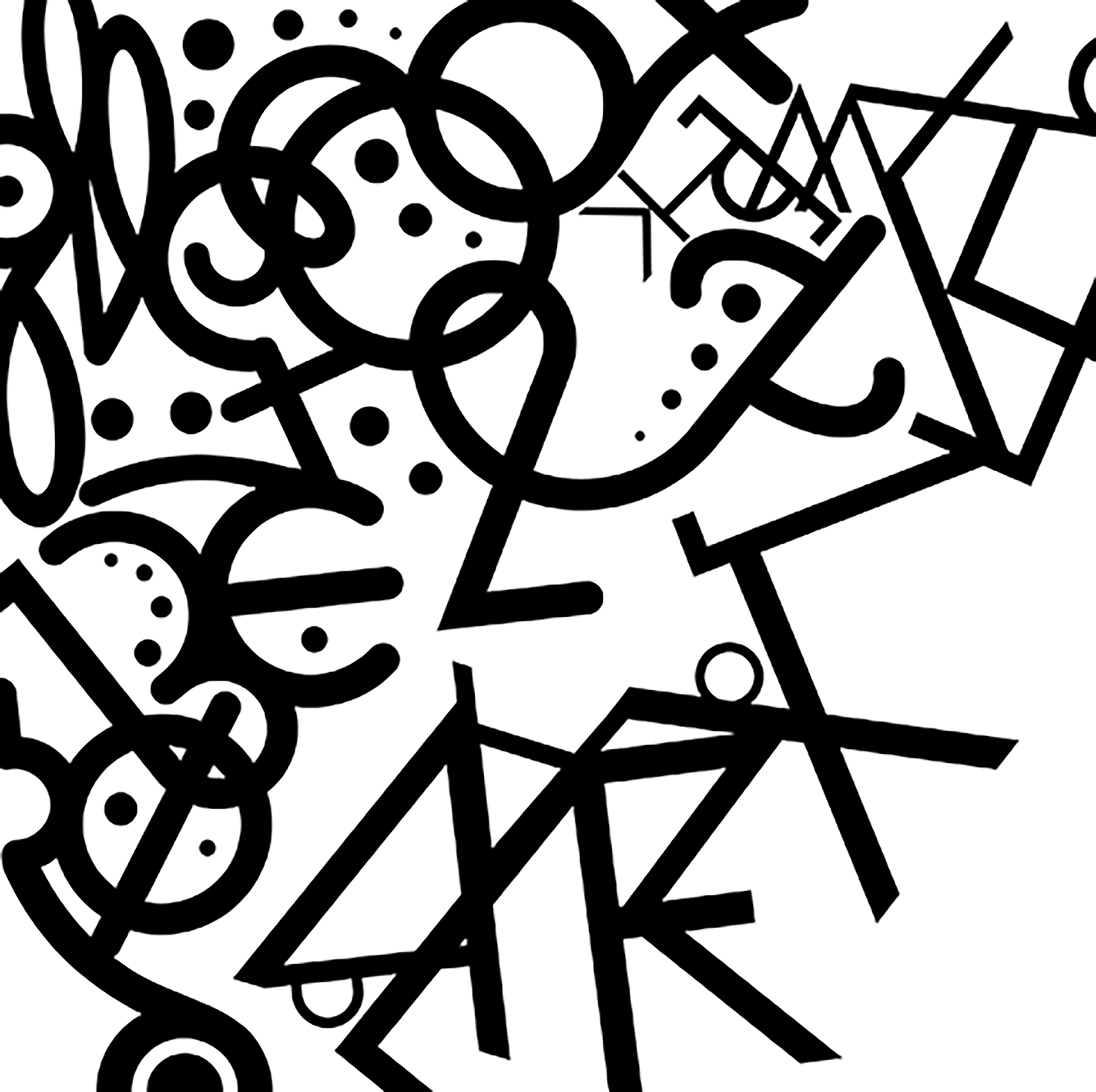
The Scramble
The second of the series we will call The Scrambler.
Much simpler than The Flower, the scrambler was an enjoyable jigsaw puzzle of finding what letters and glyph’s fit together where and allowing those organic shapes to guide the piece.
As you can see from the first process image below, it wasn’t always as pretty as it ended up being.

This organic, interlocking motif continued on into this second process image. I enjoyed crafting odd little swirls and even a smiley face.

The final version of The Scramble didn’t deviate much from the path that the process images started me on but succeeded in filling in the glaring white space.
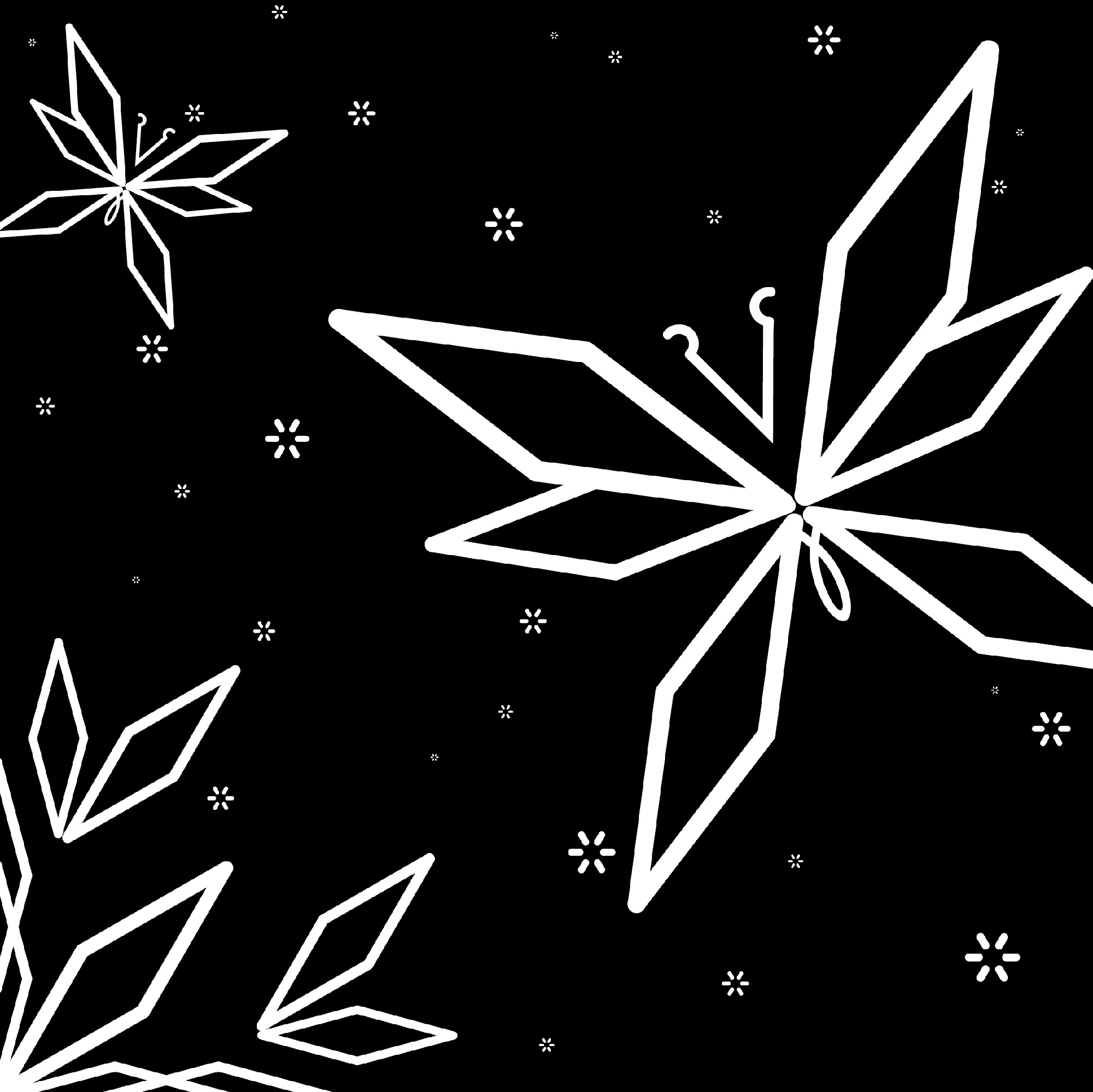
The Butterfly
The third of the series we will call The Butterfly.
This was by far the simplest of the three pieces to create. I had set up the vague nature theming with The Flower so of course what could be more appropriate than a butterfly!
I focused on lots of geometric shapes and angles while still keeping the signature rounded ends seen in the Suburban OT typeface.

The process image for this happened very quickly and only left me to fill in the white space with stars for the final product.
Final Products