Postcard Suite
This assignment had us creating postcards, icons, and color schemes. Each postcard was about a place that was visited during a road trip.
About the Project
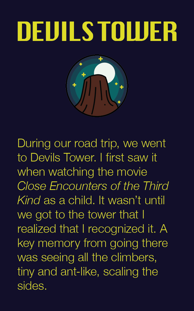
This project was the result of an assignment from a graphic design class. The goal was to create a suite of postcards where the front of each would show a custom made icon while the back explained the story of the front.
I based my postcard suite off of some family roadtrips.
The Process
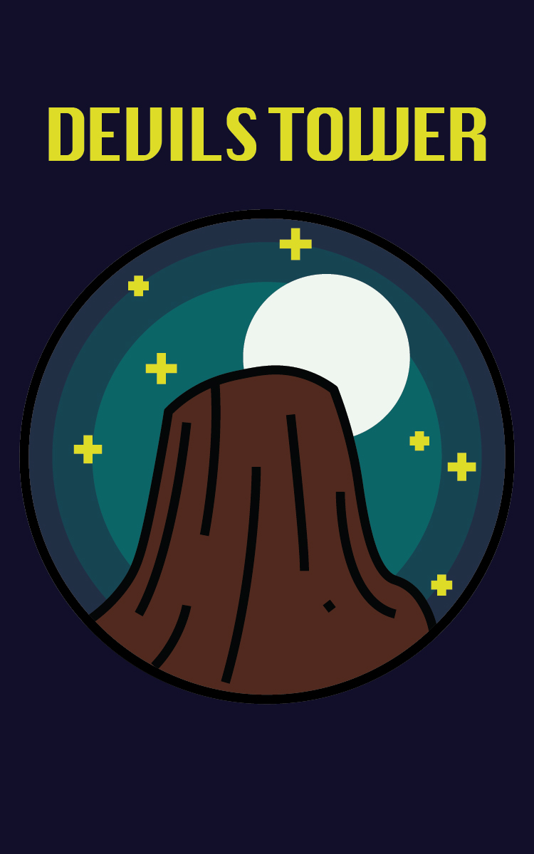
devils tower
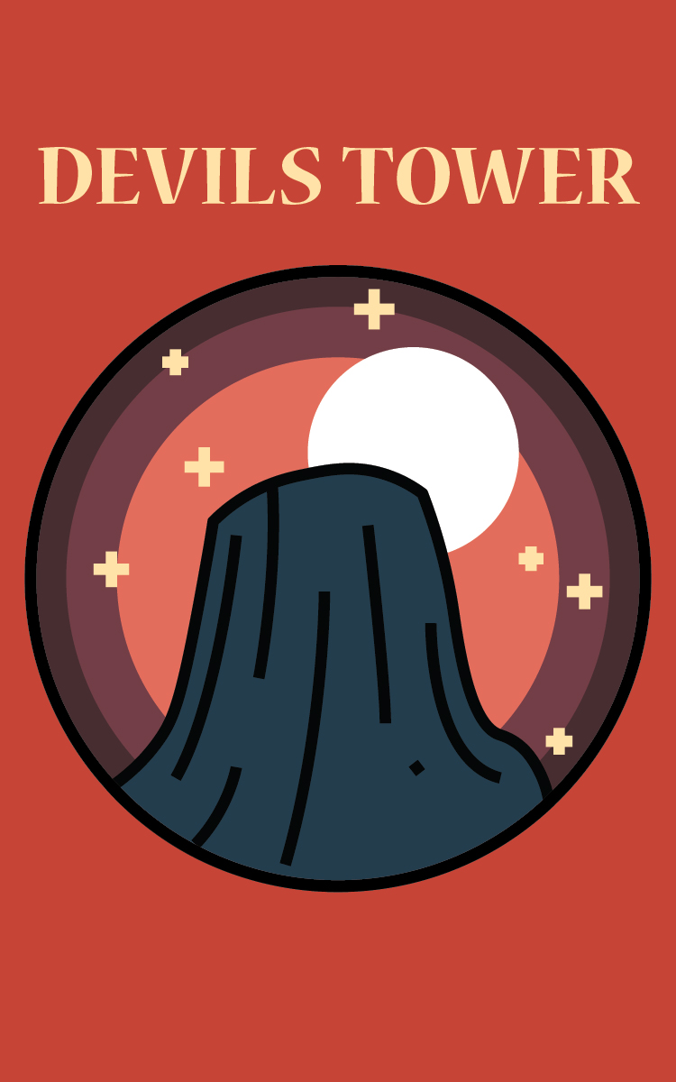
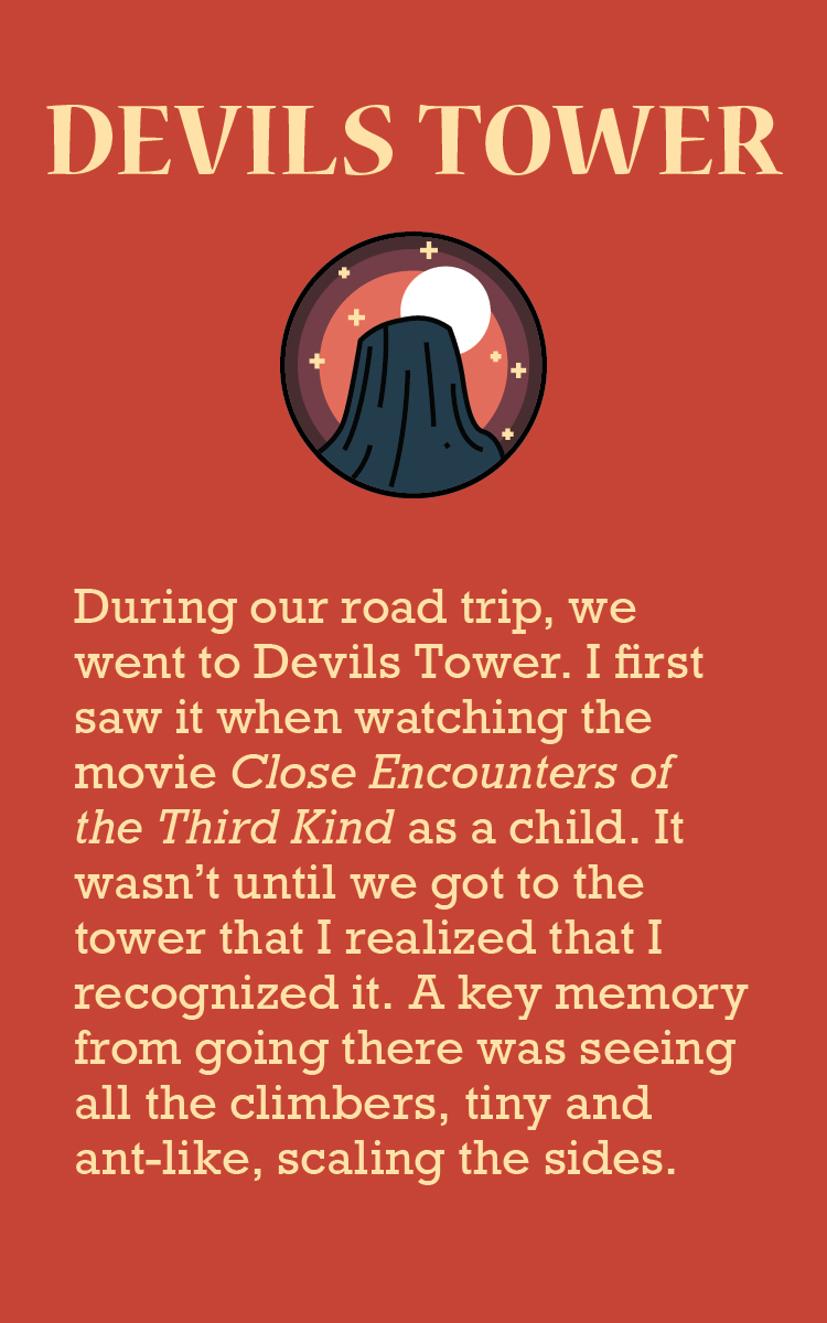
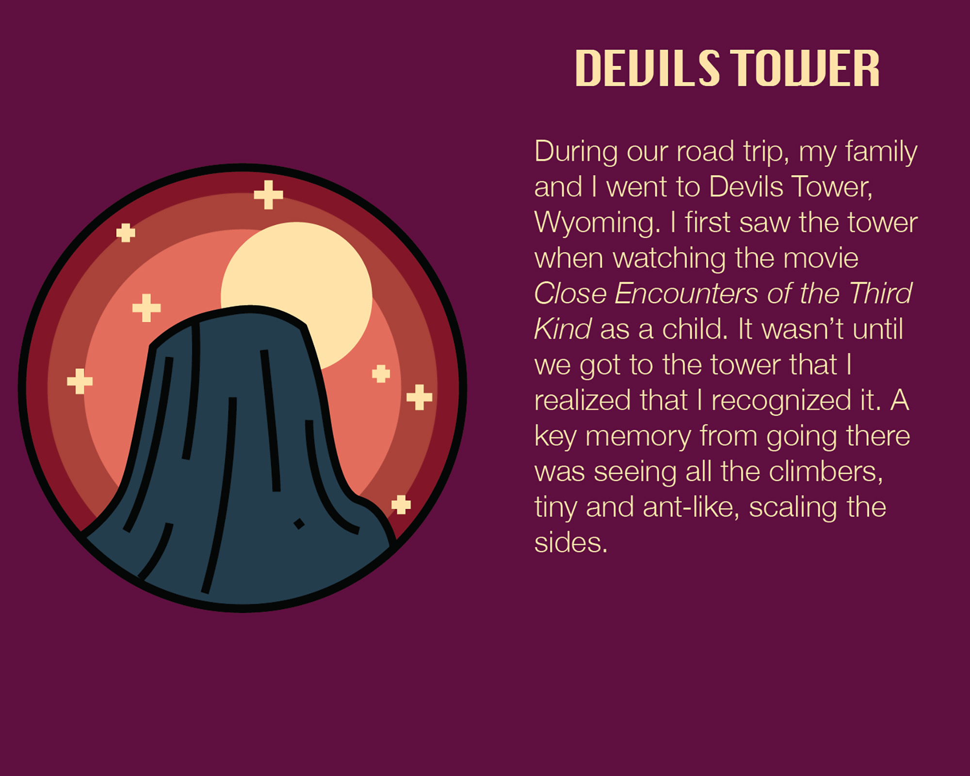
The Devils Tower postcard icon draft was what set the tone, value scheme, line width, and the pointed edges that make up the cohesive aesethics present in the rest of the postcard suite.
rv
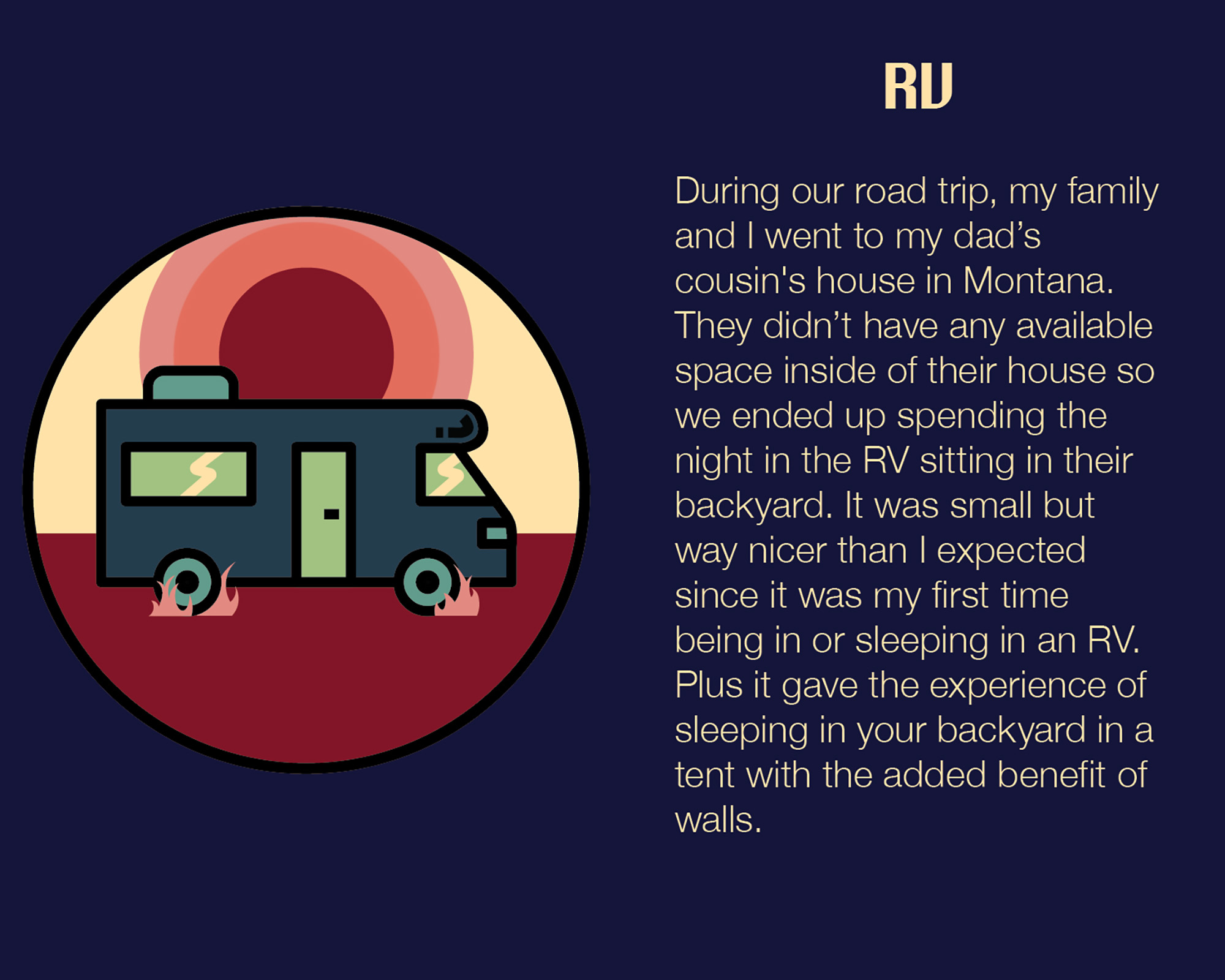
There were tons of reference images available for RVs online. The thing missing from this icon, since it is under the accommodations category, is a sense of stagnancy. This is fixed in the final version when little bits of grass are added by the wheels.
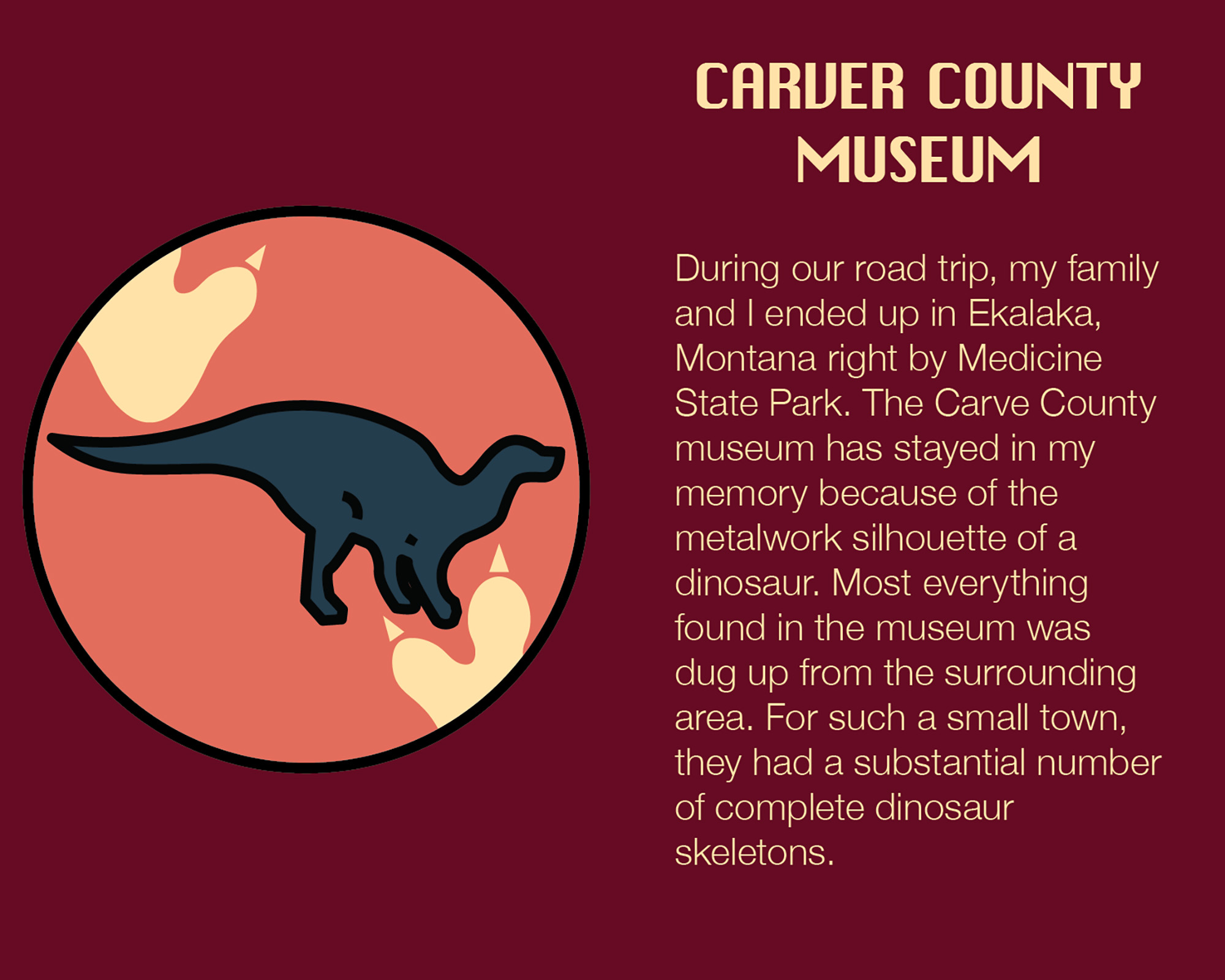
carver county museum
This was one that really required a reference image to get right. In the image next to the “About the Project” section, you can see the exact dinosaur wall decor it is supposed to be mirroring.
Funnily enough, by the time I had completed this icon, I realized that it had more visual clarity than the original metalwork, especially in regard to the triceratops skull.
badlands
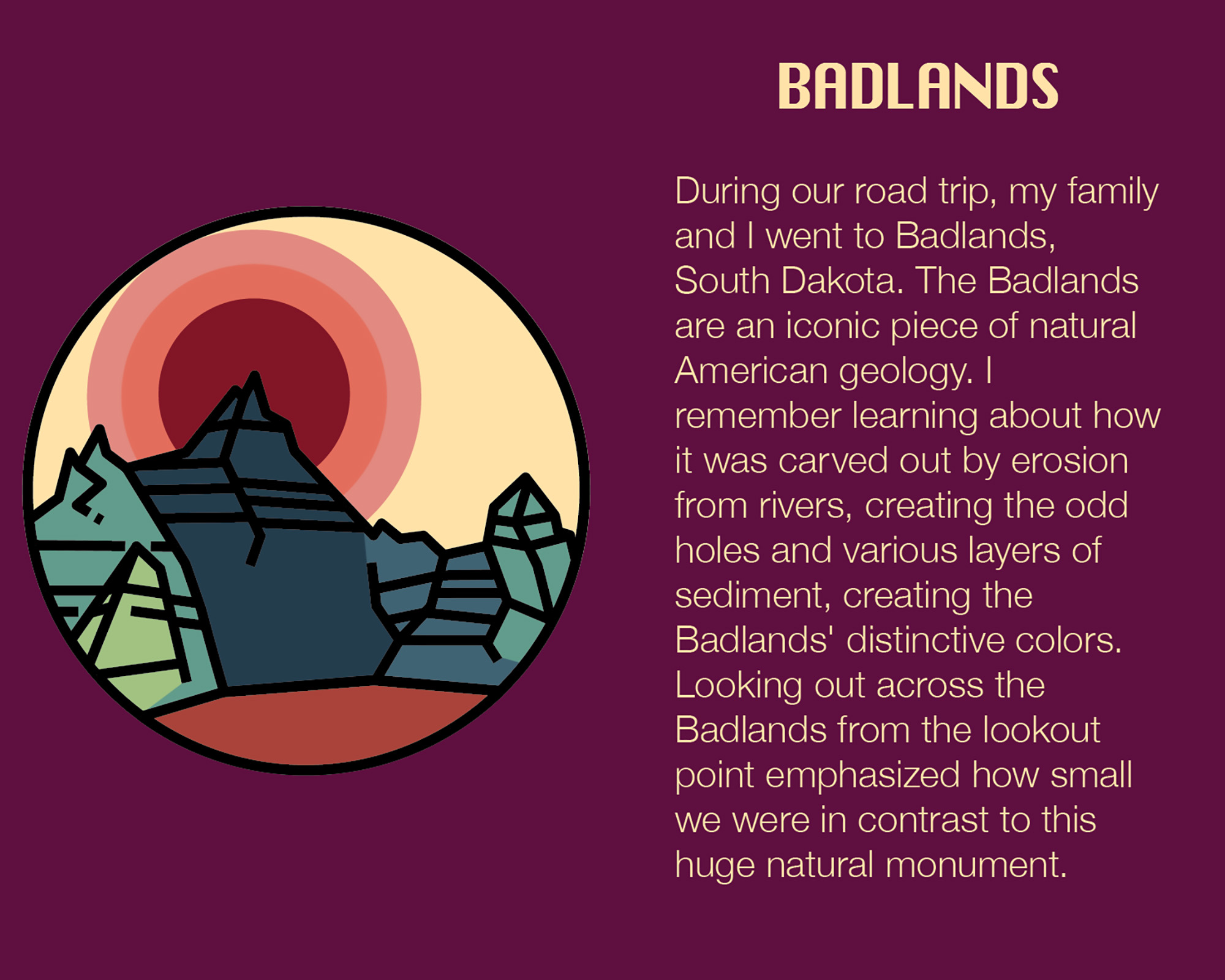
The draft for this icon was tricky because of the need to show the rock layers present in the Badlands paired with the constrictions of single thickness line weights.
While it was referencing an image, finding the balance between simplicity and accuracy in depicting the Badlands was one of the challenges of this suite.
motels & hotels
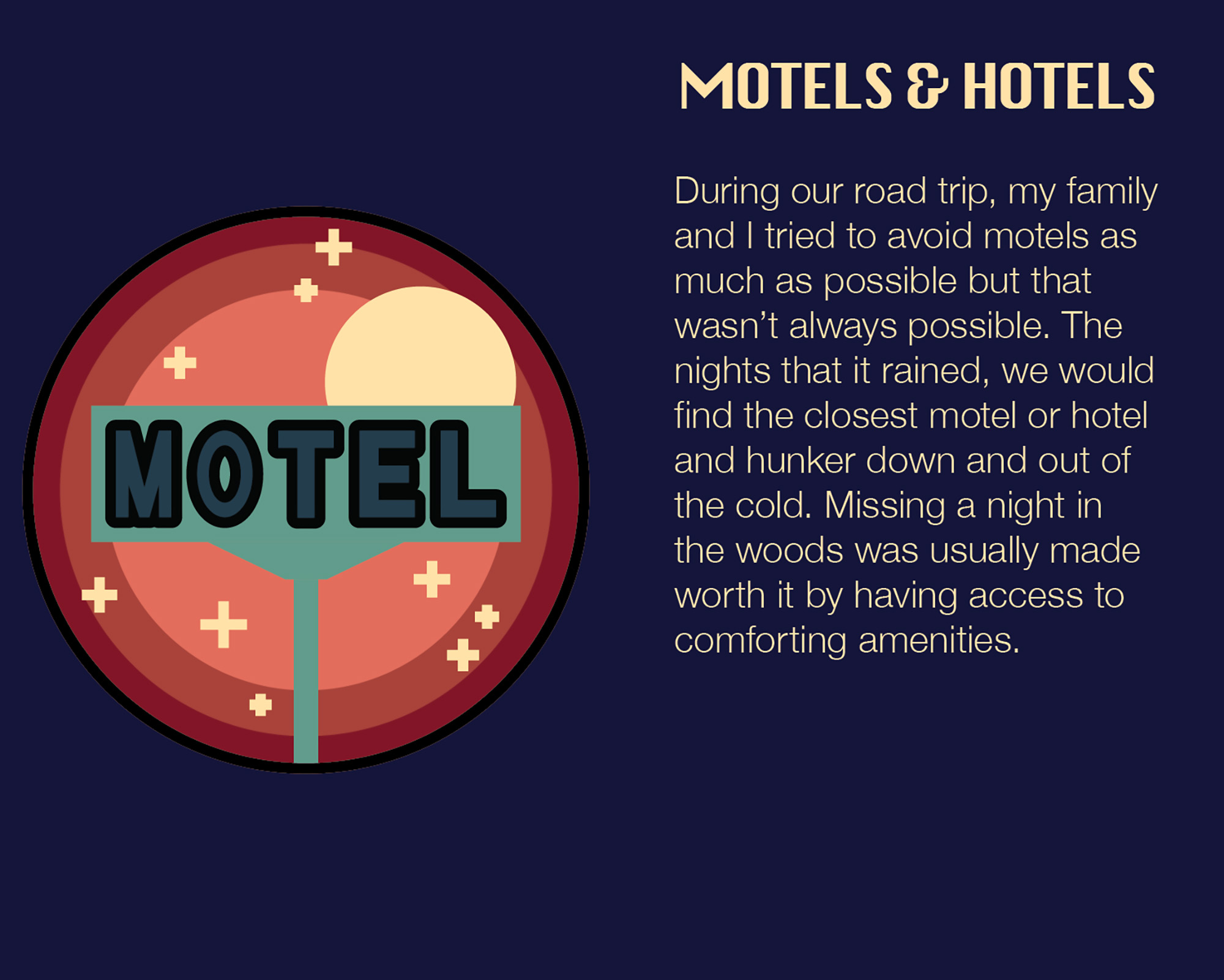
For the Motel & Hotel icon my goal was to communicate what it was. In this case, that was by making a MOTEL sign. The background is a night sky indicate the overnight quality typically associated.
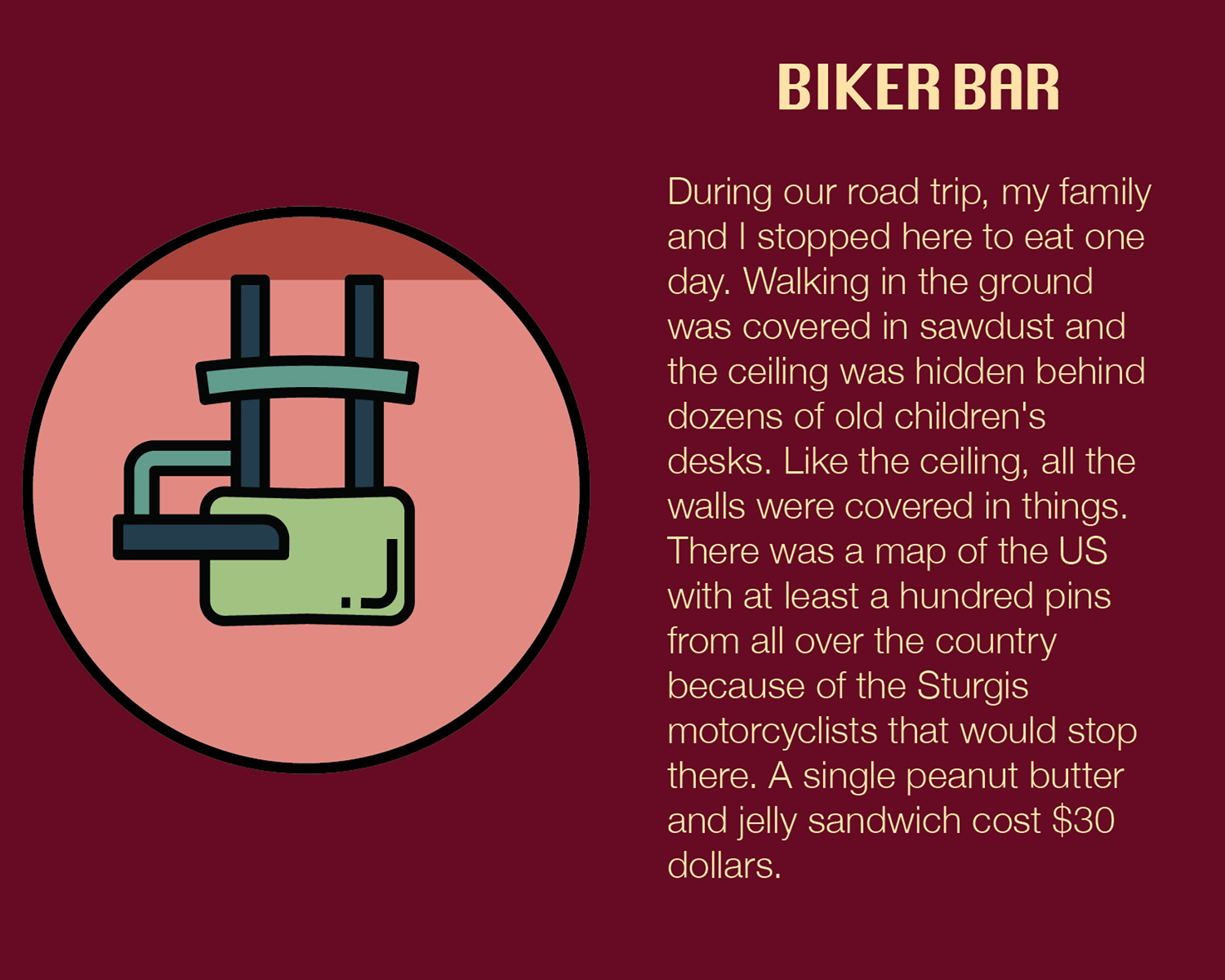
biker bar
The Biker Bar icon was the simplest of the group. Finding a good reference image and making sure that it being upside down was communicated well was the key focus.
niagara falls
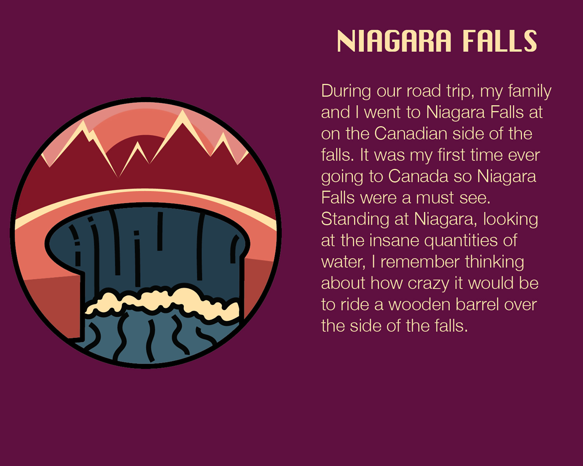
Creating a simplistic Niagara Falls was a bit of a trick. It’s very easy for it to look like any old waterfall. This meant picking a key feature of the falls, in this case Horseshoe Bay, was necessary for proper visual communication.
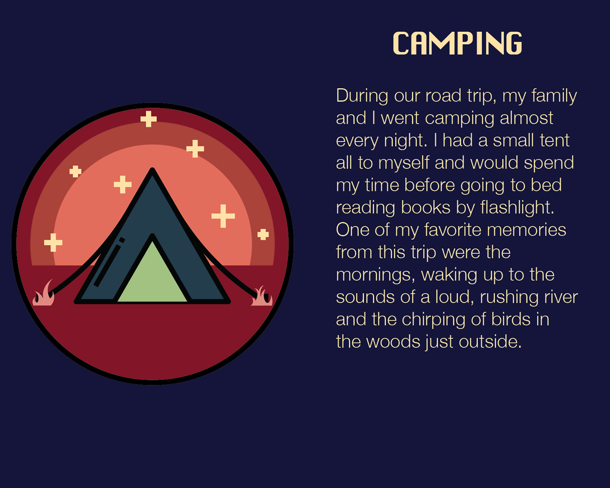
camping
This is one of the cleanest of the icons that I designed. It has the grass by the stakes that is missing from the RV and served as inspiration for the grass being put in the final RV design. The background is a sunrise because of my associations with waking up with the sun.
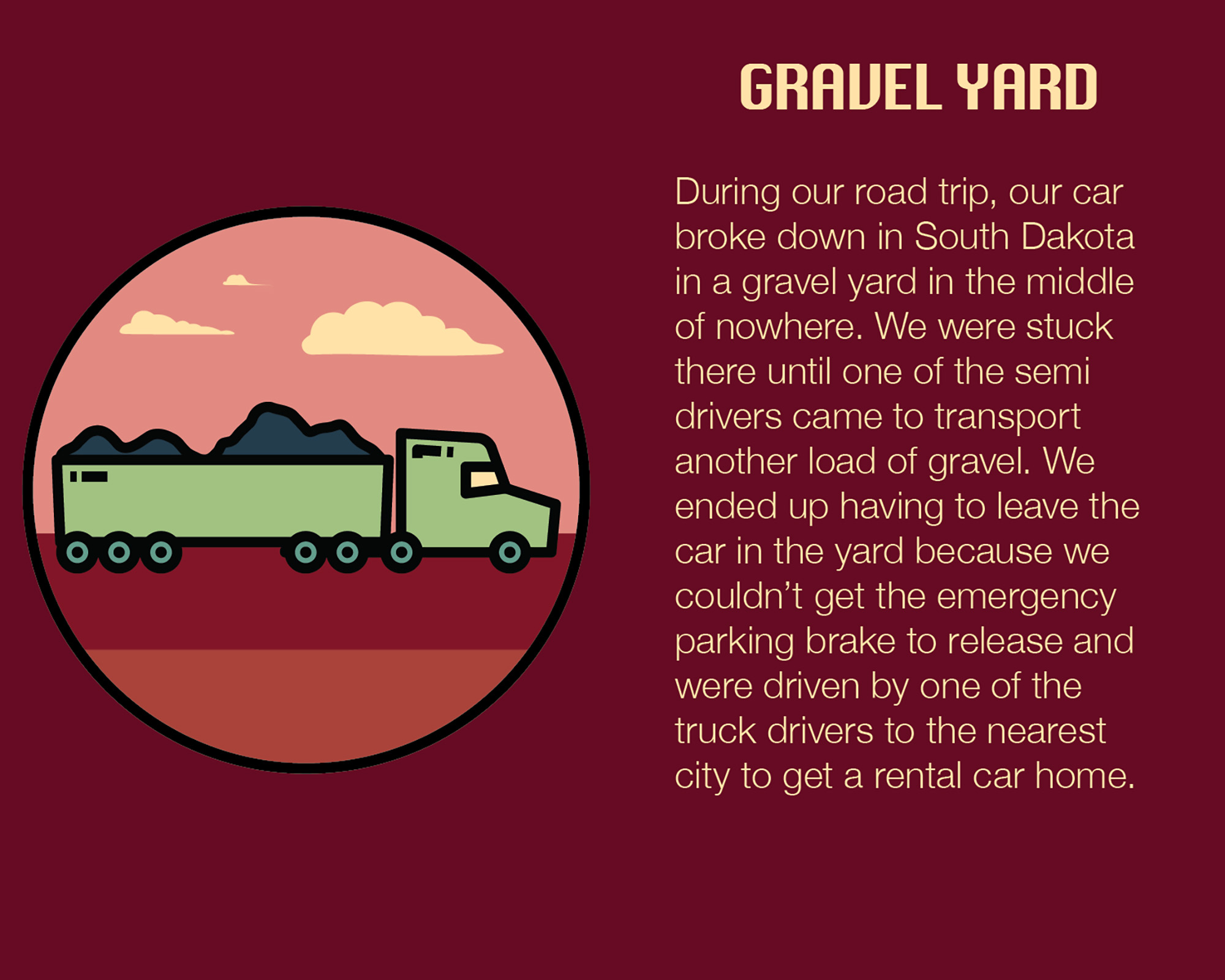
gravel yard
Shock of all shocks, you can’t really see the gravel in gravel trucks. Of the suite, this icon is likely the weakest in that even once you know what its supposed to be, the clarity isn’t 100% as present as I would have liked.
Design directions
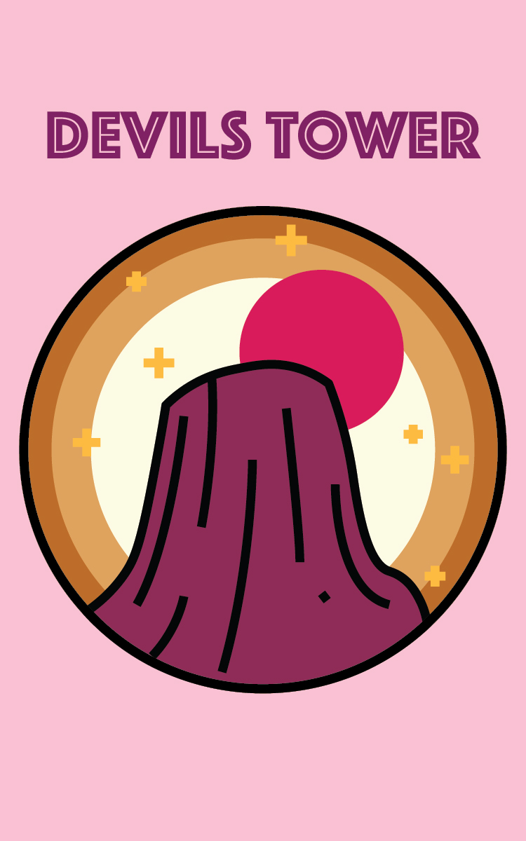
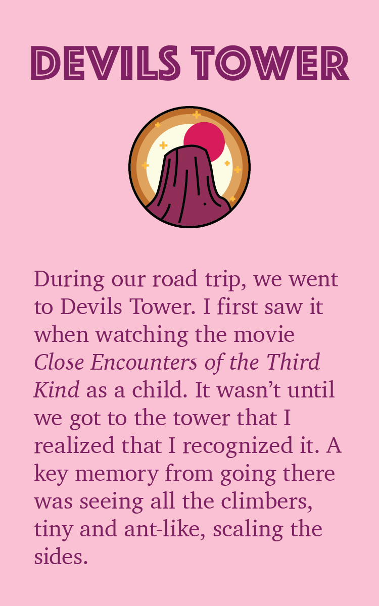
These are the 3 design directions that I came up with. Although I didn’t use any of them fully, the final designs were a combination of the 1st and the 3rd design directions along with the pale yellow of the 2nd. The finals design also use the typeface from the 1st design direction.
When creating the 3 directions I wanted to make them as different as possible while still adhering to the value coloring I had done in the drafts.
Final Product
fronts & backs
design deck

