Magazine Spread & Illustration
This assignment used a combination of illustration, typography and layout to create a dynamic magazine spread.
About the Project
This assignment was for a Graphic Design class. The aim was to create two possible direction that you could develop into a full magazine spread. The magazine spread topic was based off of the article contained in it.
We were to create an illustration, each picking a specific style with which to use and pair that with a coherent color scheme, typographic hierarchy, and any additional flairs that were needed for cohesion and readability.

The Process
The doctor
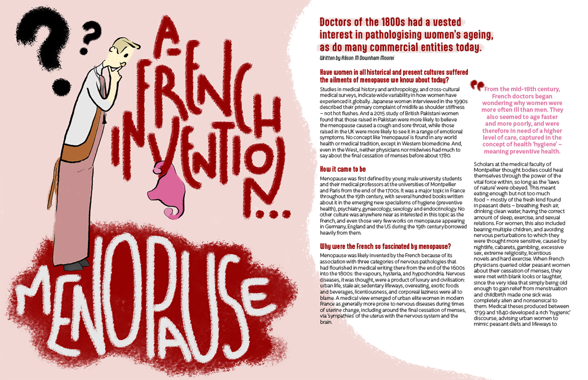
The magazine spread I created was based off an article that focused on menopause and the myths, truths, and history surrounding it.
The magazine spread I created was based off an article that focused on menopause and the myths, truths, and history surrounding it.

When looking for styles that would best fit both the topic and my sketches, I realized that it felt like something you would find in the New York Times which lead me to looking into various comics from the magazine. This, especially the style used in the comic of a woman with a bag looking at a child, was used as reference to create the doctor illustration.

For the rough draft, I was trying to get shapes, placement and silhouettes displayed correctly. I did some handwritten typography that is the connecting lead-in to the subtitle on the connected facing page. The issue with this itiration was the shaky and uneven linework on the doctor as well as no modern identifying features to denote his title. Additionally the uterus seemed to be floating in space.

The final version of the illustration varied the question marks for movement, redid the portion of the title against the pink to better fit into the newly redrawn and relined doctor. Additionally a period accurate stethescope was added to fix the prior versions issue of not denoting him as a doctor. The apron was darkened so as to help it blend into the background and bring attention to the more important elements. And finally, the uterus was given a place that gave a sense of gravity by having it hang off of the ‘V’.

The doll – scrapped
The other potential direction that I considered going was a more collage style of a woman, with her head hollowed out. Throughout the article pages the intent was to have little bottles next to pull quotes and to pull the illustration across the spread.

Below are the bottles from old advertisements that I found that was “medicine” at the time i.e. Heroin.
These bottles were removed from their backgrounds, vignetted to be more consistent with each other, and placed into the collage.

The direction that the rough draft ended up going was still collage style of a woman, but her exterior is like a doll or mask that she’s trapped within. The “medicine” poured into her head seems to be melting whatever she and her hat is made of. Ultimately this didn’t visually convey the message of the article as well as the other option did, hence it being scrapped.

the typography
This rough draft spread required 3 different typographic faces so achieve a coherence goal. The first is baked into the illustration and thus won’t elaborated upon further. The second was for headings. This means the subheading (what looks to be a title when seeing the page by itself) as well as the section headings within the body copy. Then third there is the body copy and frankly atrocious paragraph column formatting. So lets go in order!

The subtitle was written in three layers of Aptly Rust. It has am Aptly Rough outline in blood red on the top, and Aptly Rough fill text in light pink, and an Aptly Rust as a drop shadow in blood red in the back. My intent was to the blood red and pink colors from the illustration to connect them together more in the mind of the reader but it is a bit overwhelming to look at.

The headline was written in Aptly as well but Aptly Bold.

The authors name was italicized with Aptly Light Italic to keep cohesive with the rest of the non-body copy.

The body copy was written KitSans Extra Light, chosen because it was similar to the rest of the type used in that it’s a sans serif but different in that it isn’t as condensed. It was also chosen because of its readability.

The formatting for this draft of the spread was atrocious. While experimental, it did not aesthetically achieve anything with its jarringness. This is in part caused by the headings in the preceding paragraphs making the thick column of text look like I’d forgotten to continue formatting at all.

For the final version the typeface useages for headers, author, and body copy remained the same however the subheading was simplified and given a subtle pink highlight, attatching it more firmly to the illustration. The issues with the blocky column of text was remedied by inserting a pull quote. This break in the consistency of the magazine spread, added wonderful flow and visual intrigue. The quotation mark near each pull quote tells the reader what the purpose of it being there is before they read a word.
Final Product